Designing a real-time marketplace for instant, location-based tasks
Year
2024
Role
Lead Product Designer
Team
Myself + Founders + Developers
Timeline
3-4 weeks
Platform
Mobile App (iOS & Android)

Overview
Quik is a two-sided marketplace app designed to connect users with local taskers in real time. Unlike traditional platforms, it introduces "instant tasks": time-sensitive, location-based jobs matched on urgency and proximity.
I was initially brought in to review the early designs. The founders liked what I had to say and engaged me to redesign the product end-to-end, within a tight three to four week timeframe.
I owned the full product design process: UX flows, system logic, UI design, and component creation. The goal was to transform an incomplete, inconsistent product into something structured, scalable, and trustworthy enough to launch.
The Context
The initial product had been partially designed and developed, but lacked clarity and cohesion.
The app introduced a genuinely strong concept. The experience didn't support it. Onboarding failed to explain how the product worked or why someone should trust it. There was no clear distinction between the two roles. Flows were incomplete. Account setup was oversimplified for a product that required verification, payment details, and profile depth before it could function. Tasks were hard to find and harder to evaluate.
For a platform built on strangers transacting in real time, often urgently, often at someone's home or workplace, the trust gap wasn't a minor UX problem. It was the central one.
Research & Discovery
Before touching the structure, I spent time mapping where the existing product broke down — not just visually, but systemically. My initial review, the one that led to the full engagement, was effectively a diagnostic: where does the experience lose people, and why?
What emerged was a picture of a product that had been designed from the inside out. It understood its own mechanics clearly, but hadn't yet translated those mechanics into something a first-time user could orient themselves within. The two-sided nature of the platform compounded this. Posters and taskers have fundamentally different needs, different mental models, and different stakes. The existing design treated them as variations of the same user rather than distinct experiences that happened to share infrastructure.
The instant task concept introduced additional complexity. Real-time, location-based, time-sensitive transactions require users to make trust decisions in seconds, with limited information. The design had to make trust legible at a glance, through profile completeness, verification status, and rating visibility, because there's no time for deliberation when a task expires in two hours.
These weren't just interaction problems. They were the human dynamics the entire system needed to be built around.
Clarifying the Opportunity
At its core, Quik is a complex system:
• A two-sided marketplace (posters + taskers)
• Supporting both real-time and scheduled tasks
• Dependent on location, urgency, and trust
• Requiring payments, verification, and profiles
Without clear structure, this complexity quickly becomes overwhelming.
The opportunity was to:
• Bring clarity to how the system works
• Make roles, actions and flows intuitive
• Prioritise key interactions
• And focus design effort where it would have the greatest impact
Structuring the Product
One of the earliest and most important structural decisions was how to handle users who wanted to do both: post tasks and complete them.
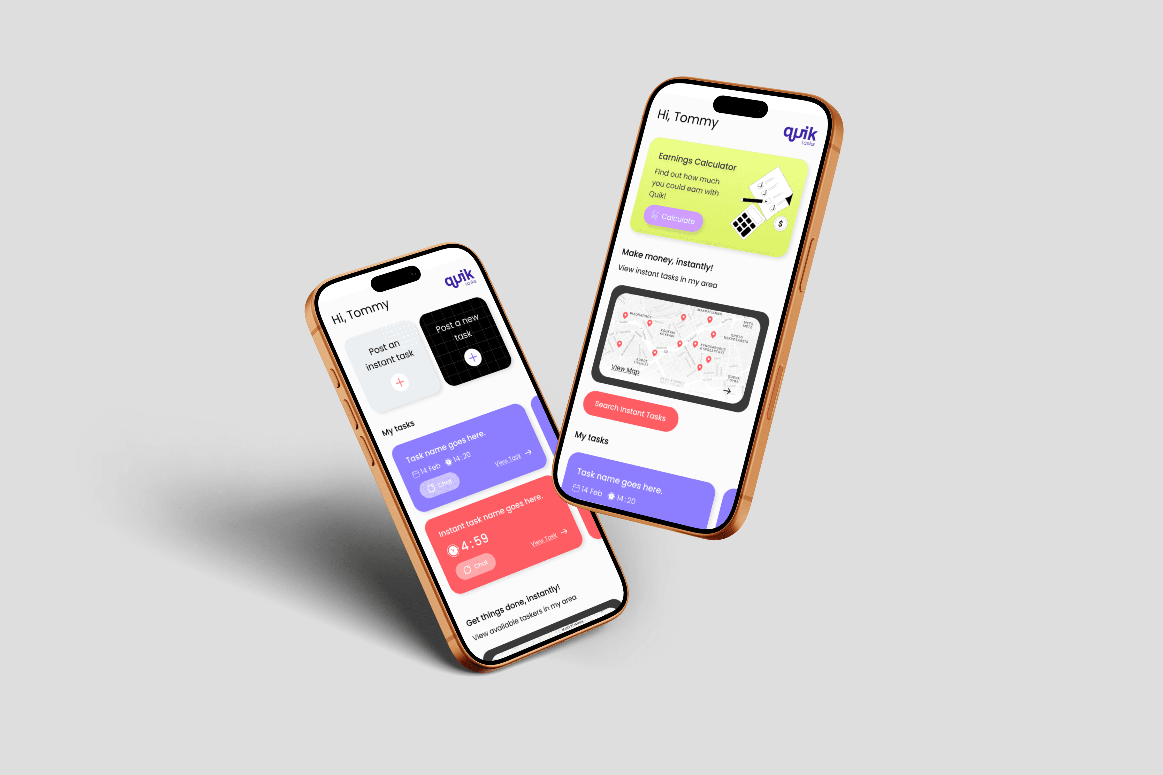
Unlike competitors who require separate accounts, Quik allows full dual-mode participation. That's a genuine differentiator, but it introduces real design risk. If a user doesn't know which mode they're operating in, they'll make the wrong decisions and lose trust in the platform fast. The colour-coded system wasn't primarily an aesthetic choice. It was a safety mechanism against that confusion.
Supporting dual roles removes friction and increases engagement; users don’t need separate accounts or workflows.
To support this, I:
• Introduced clear mode switching between Poster and Tasker
• Designed distinct home experiences for each role
• Used colour-coded UI systems to reinforce context
• Ensured users could easily switch modes at any time
This created clarity within a flexible system.

Making Instant Tasks Work
Most task platforms are built around planning. You post a job, wait for offers, compare profiles, negotiate, and schedule. That works when time isn't the constraint. It doesn't work when you need someone in the next two hours.
Instant tasks were Quik's answer to a specific kind of user: time-poor, something has gone wrong or come up, and the priority is resolution, not deliberation. The entire premise of the feature is that outsourcing should be as frictionless as making a phone call. You have a problem, someone nearby can solve it, the app gets out of the way.
Designing for that required a different set of priorities than the rest of the platform. In a standard task flow, friction can be tolerated because the user has time. In an instant task flow, friction is the enemy of the product's core value. Every extra step, every moment of uncertainty, every piece of missing information is a reason to abandon and call someone directly instead.
The design response was built around three things: visibility, legibility, and urgency without anxiety.
Instant tasks are surfaced prominently in both the feed and the map, so taskers in the area encounter them immediately rather than discovering them buried in a list. Timers communicate expiry clearly, giving both sides a shared understanding of the window without creating panic. The visual identity for instant tasks is distinct enough to be recognised at a glance, because a tasker scanning their feed shouldn't have to read carefully to identify an opportunity that might be gone in minutes.
For the poster, the flow was designed to be fast without feeling rushed. The goal was confidence: that someone nearby will see this, that the price is fair, that help is genuinely coming. For the tasker, it was about having just enough information to make a quick, informed decision, without the cognitive load of a full profile review that the timeline doesn't allow for.
The underlying design question was always the same: what does this person need to feel certain enough to act right now?

Designing Core Flows
Given the complexity, I mapped and restructured all key user flows, including:
For Posters:
• Posting a task (instant vs flexible, pricing, location, preferences)
• Reviewing and managing offers
• Tracking active tasks
• Discovering and favouriting taskers
For Taskers:
• Browsing and filtering tasks
• Viewing instant opportunities nearby
• Submitting offers
• Managing active and completed tasks
• Building profile and trust
Simplifying Task Creation
The original “post a task” flow was overwhelming; all inputs on a single screen, yet still incomplete.
I redesigned this into a multi-step flow, allowing users to focus on one input at a time.
Key improvements included:
• Clear separation of task type (instant vs flexible)
• Structured inputs for pricing (hourly vs total)
• Category selection for better matching
• File uploads for clarity
• Preferences (skills, language, requirements)
This reduced cognitive load while improving data quality.


Improving Discovery & Matching
To support a marketplace, discovery needed to be significantly improved.
I introduced:
• Advanced sorting (price, distance, time remaining, etc.)
• Category-based filtering
• Personalised recommendations
• Favourites for both tasks and taskers
• Dedicated search functionality based on user mode
This transformed browsing from a static list into a flexible, user-driven experience.
Fixing Onboarding & Activation
The original onboarding failed to prepare users for the product.
I reworked it to:
• Clearly explain the two roles and how the app works
• Introduce key features early
• Avoid overwhelming users upfront
Given the amount of required account information (verification, payments, profiles),
I also:
• Deferred complexity
• Introduced progress tracking (“3 steps to go”)
• Encouraged completion over time
• Reinforced progress with positive feedback
This balanced simplicity with necessary depth.


Key Design Decisions
Colour as System
The colour-coded role system, lavender for poster mode, lime for tasker mode, watermelon for instant tasks, was designed to do one thing: make context unmistakable. When a user switches roles, the entire interface shifts register. There's no ambiguity about which set of actions is available, which tasks belong to them, or what decisions they're being asked to make. In a platform where the same person can be a buyer and a seller within the same session, that clarity isn't cosmetic. It's structural.
Focused Prioritisation
A three to four week timeline doesn't allow for everything. The discipline was in deciding what to defer without compromising the core. Core flows, home experiences, navigation, onboarding, and activation were non-negotiable. Messaging, the earnings calculator, and a full map redesign were identified but deliberately scoped out. The goal was a product whose critical paths were resolved properly, rather than one where everything was partially addressed.
That constraint sharpened the work considerably.
Constraints
This project was shaped by several constraints:
• A highly compressed timeline (3–4 weeks)
• Inherited, inconsistent design files
• Limited budget
• No development QA within scope
As a result, some areas, such as deeper onboarding education and payment transparency, were identified but not fully explored.
Outcome
The final outcome was a complete product redesign, including:
• End-to-end UX flows
• Full UI system and components
• Structured, scalable design logic
• Developer-ready files with annotations
The founders approved the full direction and moved forward with development.
While the product has not yet launched in its intended form, the redesign established a clear, functional foundation for the platform. The redesign gave the product something the original lacked: a coherent internal logic that a user could feel, even without being able to articulate it.
Theodore Hamalis
Co-founder, Quik App
Reflection
This project reinforced the importance of structure in complex product systems.
Marketplace platforms require careful balance: between flexibility and clarity, speed and trust, simplicity and depth. Without clear flows and hierarchy, even strong ideas struggle to translate into usable products.
Designing within a tight timeframe also required strong prioritisation. Leveraging familiar UI patterns allowed for speed, while focusing innovation on key differentiators ensured the product retained its uniqueness.
If taken further, I would prioritise:
• User testing to validate assumptions
• Deeper onboarding to explain real-time mechanics and payments
• Additional support and education layers to build trust
Designing for real-time systems highlighted the importance of immediacy, clarity and feedback, particularly when users are making quick decisions based on location and time.
Design System


About
Case Studies
Capabilities