Year
2025
Role
Lead UX/UI Designer
Team
Myself + Developer + Founder (Head Naturopath)
Timeline
~3 months (UX, design, and rollout), ongoing refinement
Platform
Custom CMS

Overview
Melbourne Natural Medicine Clinic is one of Australia’s leading natural medicine clinics, with a strong reputation and a deeply knowledgeable founder.
Despite this, their website was underperforming – not due to a lack of content, but because of it. Years of SEO-driven expansion had resulted in a bloated, difficult-to-navigate experience that made it hard for users to find relevant information or feel confident taking the next step.
I led the redesign end-to-end, owning UX strategy, information architecture, content structure, tone of voice, and visual design. This project was grounded in a single question:
Why do people turn to natural medicine in the first place — and what do they need to feel safe enough to take the next step?

The Context
The clinic had grown significantly over time, both in reputation and in content.
Multiple agencies had contributed to SEO efforts, resulting in a large volume of pages, many of which were outdated, duplicated, or misaligned with the clinic’s actual offering. Some content was keyword-driven to the point of being confusing or even inaccurate.
At the same time, the clinic had moved into a beautifully designed, premium physical space. The digital experience no longer reflected the level of care, professionalism or trust patients would encounter in person.
Users were arriving on the site but struggling to find what they needed.
Clarifying the Opportunity
The core issue wasn’t a lack of information.
It was a lack of structure.
Conditions were presented as long, overwhelming lists with no hierarchy.
Services were buried and inconsistently categorised.
Navigation didn’t align with how users actually think or search.
Interlinking between pages was difficult to follow.
Users often relied on search just to navigate the site.
More importantly, the experience lacked empathy.
Many patients arrive feeling frustrated, dismissed, or unheard within traditional healthcare systems. The website wasn’t acknowledging that emotional context, or helping users feel understood and supported.
The opportunity was to create a system that:
Made complex information easy to navigate
Reflected the clinic’s expertise and credibility
And supported users emotionally, not just functionally
Understanding the User
Before touching structure or content, I spent 90 minutes in conversation with the clinic's founder — a practitioner who has worked with hundreds of patients over many years. Rather than asking about the website, I asked about the people.
What emerged was a clear picture of five distinct user archetypes: women navigating perimenopause and hormonal change; younger patients dealing with acne and cycle-related issues; men in their 50s responding to a recent health scare; older patients seeking to age independently without pharmaceutical dependency; and parents managing a child's neurodevelopmental diagnosis. Women made up roughly 80% of the patient base — a demographic the founder described as notably more proactive about health, a pattern I'd observed independently across another healthcare client.
The most significant insight came from a single question:
Why do patients choose natural medicine over their GP?
The answer was consistent: they feel dismissed. They arrive having already sought help through conventional channels, having been told their symptoms are normal, their concerns are manageable, or that nothing is clinically wrong. They are not looking for more information. They are looking for someone, or something, that finally acknowledges what they're going through.
This reframed the entire design problem. The website didn't just need to be clearer. It needed to do something the medical system hadn't: make people feel heard before asking them to trust.

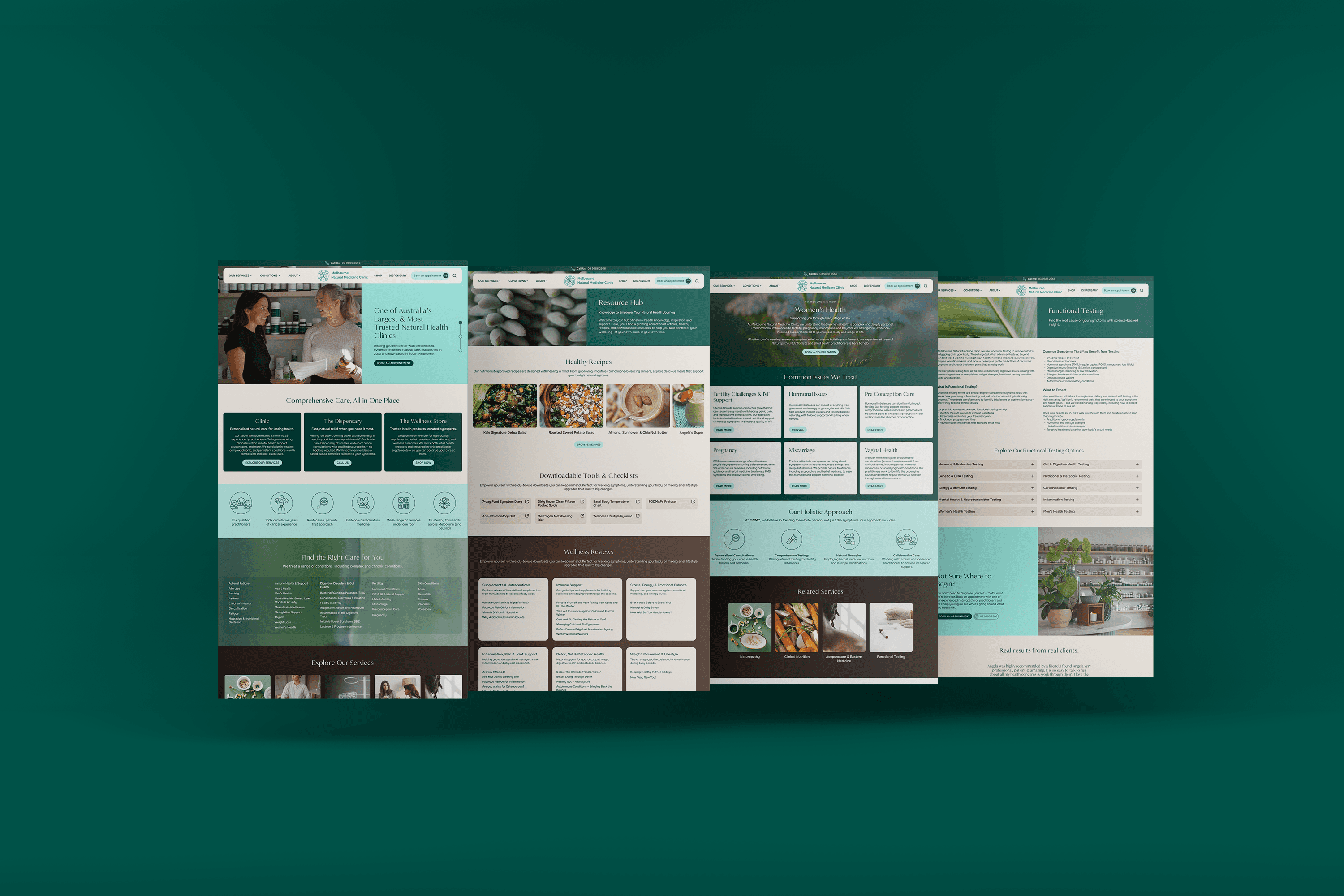
Bringing Structure to Complexity
Rebuilding the Information Architecture
This project began with structure, not visuals.
I led card sorting and content mapping exercises to understand how users might search for information:
By condition or symptom
By treatment or service
By diagnostic test
We explored alternative models, including organising content by body systems. However, this approach proved too restrictive for a holistic practice, where conditions often span multiple systems.
The final structure was built around three core pathways:
Conditions, Services & Tests
This model aligned with both user intent and SEO behaviour, allowing users to quickly validate whether the clinic could support their specific needs.
Designing for Discoverability
Each pathway was carefully structured for clarity and depth:
Large content sets were broken into intuitive subcategories
Pages were interconnected to guide users naturally between related information
Conditions linked to relevant services, tests and practitioners
Tests linked back to the conditions they support
This created a cohesive system where users always had a clear next step, reducing friction and encouraging exploration.

Simplifying and Refining Content
The site previously contained over 200+ pages, many of which were redundant or low-value.
I led a full content audit and cleanup, removing outdated pages and consolidating information into a smaller, more focused set of high-quality content.
From there, I developed a scalable content system across:
Condition pages
Service pages
Test pages
Each followed a consistent structure:
What it is
Signs and symptoms
Root causes and contributing factors
How the clinic can help
Related services, tests and practitioners
Clear call to action
Content was rewritten to balance medical accuracy with accessibility, introducing key ideas simply, then layering detail for users who wanted to go deeper.
The goal wasn’t to overwhelm with information, but to build trust and clarity quickly.
Designing with Empathy
The interview made one thing unambiguous: empathy wasn't a tone-of-voice decision, it was a structural one. Users arriving emotionally guarded, after being failed or dismissed elsewhere, would not convert through information alone. They needed validation first.
This drove a deliberate content hierarchy: acknowledge the experience → validate the frustration → demonstrate expertise → present a pathway forward. Every condition page, every homepage section, was sequenced around that emotional arc.
Content Outline Spreadsheet

Content On Site (some sections have been removed to provide a condensed view)

Collaboration & Constraints
This was a highly collaborative project.
The founder (and head naturopath) was deeply involved in shaping the content and interlinking logic, bringing invaluable clinical insight into how conditions, treatments and tests relate.
Translating this level of expertise into clear, accessible content was one of the most challenging – and rewarding – aspects of the project.
There were also practical constraints:
Significant manual effort was required to map relationships between conditions, services, tests and practitioners
Interlinking logic was complex to implement within the CMS
Content volume required careful QA to ensure consistency and accuracy across all pages
Some structural decisions required balancing ideal UX with stakeholder preferences
Weekly presentations and ongoing workshops ensured alignment throughout.
Impact Drivers
The results were substantial, but driven by a combination of decisions rather than a single change.
Key contributors included:
Information architecture
Clear pathways made it immediately obvious whether the clinic could help, reducing uncertainty and increasing intent.
Content clarity
Structured, scannable content improved comprehension and trust.
Tone of voice
Empathetic language resonated with users who felt dismissed elsewhere, increasing emotional connection and conversion.
Trust signals
Prominent reviews and clear practitioner connections reinforced credibility.
Mobile usability
A clean, intuitive mobile experience supported the majority of users accessing the site on smaller devices.
Impact
The redesigned website delivered significant improvements across both engagement and conversion:
%
increase in form submissions
%
increase in phone enquiries
%
increase in average engagement time
%
increase in booking interactions
Users are now able to find relevant information quickly, understand their options clearly, and feel confident taking the next step.
The clinic continues to receive consistent positive feedback from patients, particularly around how clear, supportive and easy the website feels to use.
Reflections
This project reinforced the importance of clarity and empathy in healthcare design.
Medical information is often complex, but that complexity shouldn’t become a barrier. Structuring content in a way that allows users to engage at their own depth proved critical, particularly for those navigating uncertainty or stress.
Designing for vulnerable users requires more than usability. It requires sensitivity to emotional context – acknowledging that behind every search is a person trying to understand what’s happening to their body.
From a process perspective, this project also highlighted the scale of content-heavy work. Information architecture and content design are substantial undertakings, and benefit from dedicated focus over time.
If refining further, I would continue evolving the resource hub, introducing more structured, editorial-style content and expanding supporting materials to deepen engagement.
This project also reinforced the value of even a single deep research conversation. One well-structured interview with someone embedded in the user community produced insights that shaped every major design decision. It also highlighted what I'd do differently: I'd want to supplement founder insight with direct patient interviews to validate assumptions and surface perspectives the clinic itself might not see.