Year
2024
Role
Lead UX/UI Designer
Team
Myself + Marketing Manager + Technical Lead (client) + SEO Specialist (agency)
Timeline
~5 months (UX, brand, design), pending development
Platform
Custom CMS


Overview
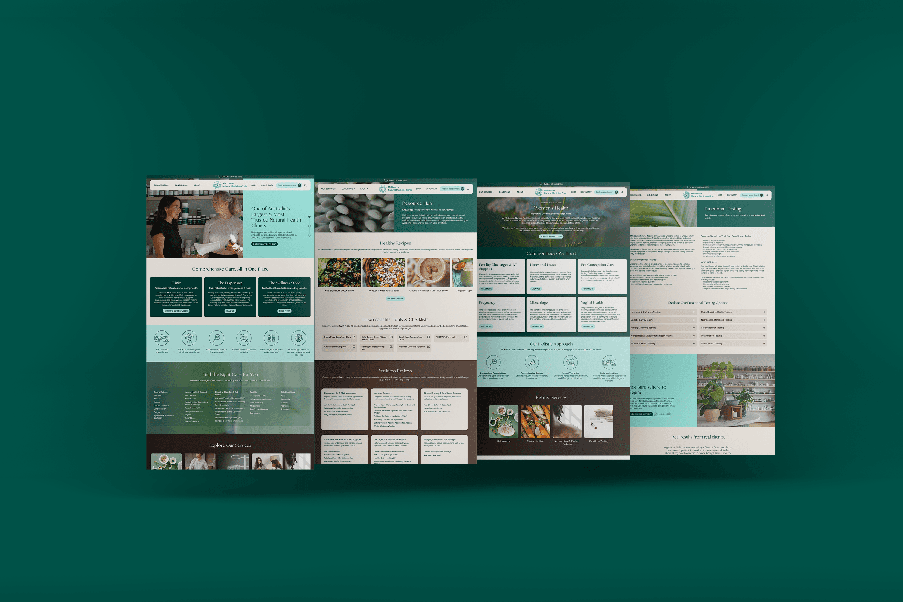
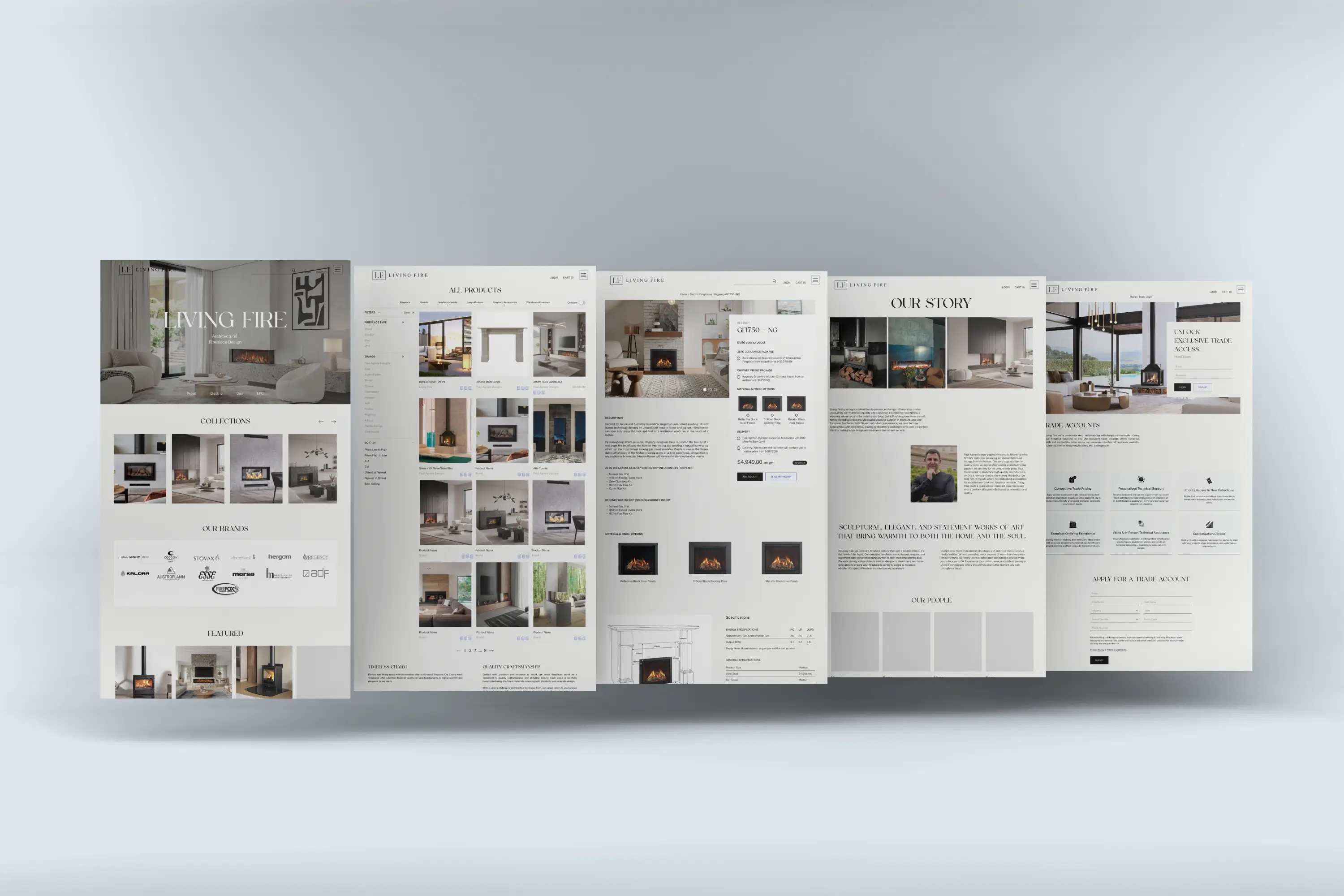
Living Fire is a Melbourne-based supplier of premium fireplaces, working across both retail and trade, including architects, interior designers and property developers.
Despite offering some of the most beautiful and technically sophisticated products in the market, their website was failing both audiences. It functioned more like a product catalogue than a decision-making tool, and it didn't come close to reflecting the quality of what was being sold.
I was brought in to redesign the experience end-to-end, across UX, brand and digital, with the goal of transforming the site from a passive browsing tool into a high-performing sales and lead generation platform.
The challenge was to create something that felt as premium as the product itself, without sacrificing the depth required to make confident, high-consideration decisions.
The Context
Living Fire sits at the intersection of two very different worlds.
For retail customers — renovators, first home owners, couples building their dream space — a fireplace is an emotional purchase. Aspirational, considered, and tied to a vision of home. For trade customers, including architects, builders, interior designers and property developers, it's a technical specification. They need drawings, compliance documents and installation guides before they ever pick up the phone.
The existing site served neither audience well. It was visually dated, technically shallow and structurally flat, with no clear pathway to conversion, no product comparison, no accessible documentation, and pricing that was either hidden or absent. For trade users especially, there was little reason to return.
Meanwhile, the business had a clear strategic goal: shift the customer mix from 50/50 retail and trade, to 70% trade. That ambition required a digital experience purpose-built for professionals.
Before a single wireframe was drawn, the gap between the product and the experience was obvious. This wasn't just a visual problem.
Research & Discovery
This project began with conversations, not screens.
I ran structured interviews with the sales team to understand what was actually happening on the floor — what questions customers asked most, where they got stuck, and what information drove or stalled decisions.
What emerged was a picture of six distinct customer types, each arriving with fundamentally different needs: the retired retail couple who comes in with a photo and needs to feel the product before committing; the first home owner who arrives aesthetics-first after weeks of online research; the tradesperson focused on specs and purchasing for projects; the property developer who comes with specs drawn up and wants comparisons; the architect who researches online then visits the showroom and just wants the manual; and the interior designer who relies almost entirely on the salesperson relationship.
These weren't abstract personas. They were patterns the team encountered every single day, and they shaped every structural decision that followed.
These weren't used as decoration. The retired couple shaped the emotional register of the product detail pages — high-quality contextual imagery, warm editorial tone, a focus on feeling as much as specification. The architect and property developer shaped the technical library and trade portal — they needed documents, not persuasion. The first home owner shaped the navigation structure — someone arriving aesthetics-first needed a browsing mode that didn't immediately demand technical decisions.
A key insight: the sales team was doing the website's job. Customers were walking in to get information the site should have given them already.
This single insight — that the sales team was fielding questions the website should have already answered — became the diagnostic frame for the entire redesign. Every structural decision that followed was tested against one question: does this put the information in the user's hands before they need to ask for it?

Brand Direction
Before any screens, the brand needed a foundation.
The existing visual language wasn't competing in the premium interiors space. Typography was generic, the palette had no point of view, and the overall impression didn't reflect the quality or heritage of what Living Fire sold. Customers walking into the showroom encountered something beautiful. Customers landing on the website didn't.
The brief I set for myself: make the website feel like the product deserves.
Palette
The colour system is built on restraint, with a deliberate creative decision at its heart. Midnight navy, stone and white form the core — architectural and uncluttered, creating a backdrop against which the fireplaces become the focal point.
Most fireplace brands default to reds, oranges and yellows — the obvious visual language of flame. We didn't want to fall into that trap. Instead, we chose to hero blue: the underappreciated fire colour, and the one ever-present in Living Fire's electric and gas ranges. Royal blue and electric blue form the primary accents, with burnt orange and orange as counterpoints. Sitting on opposite ends of the colour spectrum, they create tension and dimension. Used sparingly, they add creative flair without disrupting the calm minimalism that luxury demands.
Typography
The typeface pairing balances editorial presence with digital readability. The serif brings gravitas and legacy — appropriate for a brand with 60 years of history. The sans-serif grounds it for the screen, providing clarity across product names, specs and interface copy. Together they feel authoritative without being cold.
Photography direction
Imagery was treated as a brand decision. The direction emphasises fireplaces as sculptural objects photographed within considered interiors — not appliances, but the thing a room is built around. This set the standard for product photography across PDPs, where contextual imagery directly influences a customer's ability to imagine a product in their own space.
Tone of voice
Four values anchor the brand: uncompromising quality, innovative design, personalised service and architectural elegance. The tone that emerged is confident and knowledgeable, sophisticated but warm — mirroring what a fireplace actually does to a room.
I wrote the brand story for the Our Story page from scratch, grounding Living Fire in its founder's history: Paul Agnew's childhood salvaging antique architectural fittings, his move to the UK, and the family legacy that has shaped the business over 60 years. That story gave the brand something real to stand on.
The full system was documented in a comprehensive brand guidelines document covering logo usage, colour, typography, photography direction, tone of voice and iconography.
Restraint, applied consistently, is what makes something feel premium. A considered accent of unexpected colour is what makes it memorable.
Designing for two types of users.
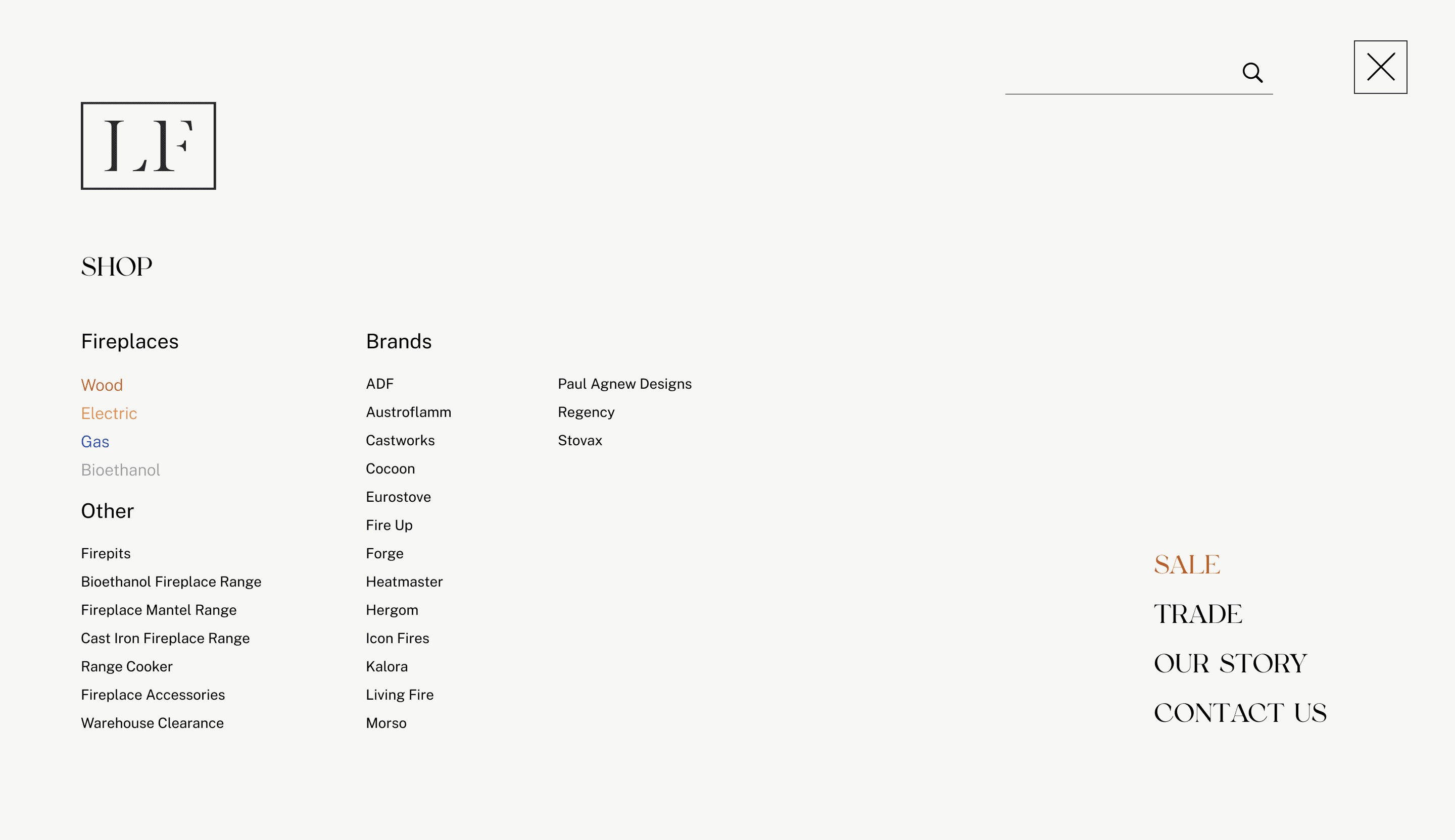
Customers arrived in two very different states of mind: some knew exactly what they wanted and needed to validate a decision; others had no idea where to start. The navigation had to serve both.
The menu was reorganised around three primary browsing modes — by fireplace type, by brand, and by product category — giving users multiple entry points depending on how they think about the purchase. Fireplace types were assigned distinct colours across listing pages, product cards and filters, creating a persistent wayfinding system that orientates users without requiring them to re-read labels.
The navigation was also split to acknowledge the dual audience: a retail pathway focused on discovery and purchase, and a trade pathway focused on access, documentation and pricing.

Experience
Hybrid purchase model
Not every fireplace can be sold online. Electric fireplaces could be purchased directly. Gas, wood and bioethanol products required consultation. Rather than obscuring this, I designed the system to make it clear and frictionless — direct checkout where appropriate, and quote and enquiry flows where a conversation was genuinely needed. Enquiry forms were pre-filled from product pages so users never had to start from scratch.
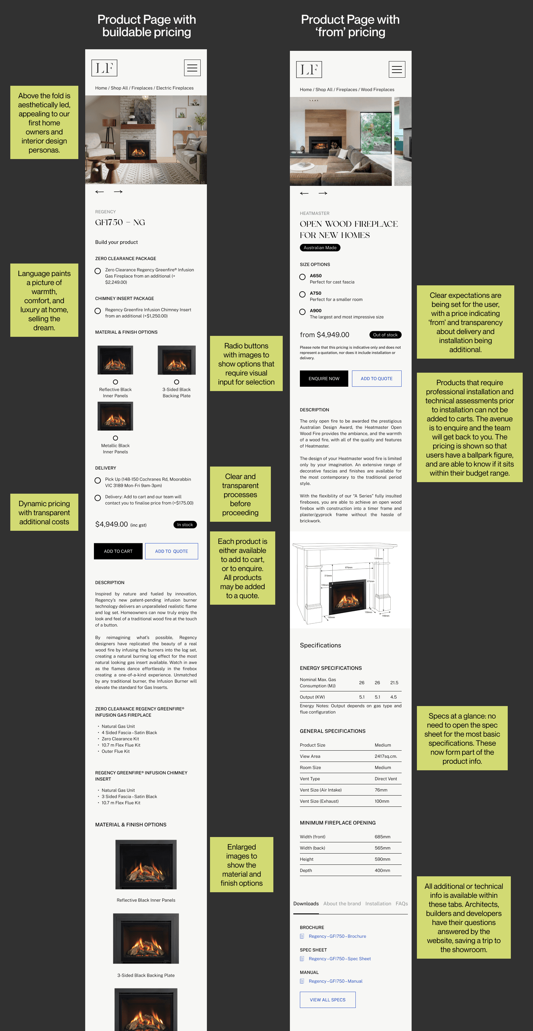
Buildable pricing
The most consistent barrier to purchase was uncertainty around total cost — a problem the previous site made worse by either hiding pricing entirely or leading with a misleading base number. I introduced a buildable pricing model that breaks cost into its real components: unit, flue system, accessories, and installation.
This wasn't straightforward to implement honestly. Fireplace installations are genuinely variable; the right flue system depends on factors a customer often can't assess themselves, and installation complexity differs case by case. Rather than pretending otherwise, the solution was designed around transparency about that uncertainty: 'from' pricing with visible component costs gives customers a realistic range early, without overpromising. Half the product range can only be added to quote, not cart, and rather than obscuring that distinction, the design makes it clear and explains why. A customer who understands they need a consultation is a better lead than one who feels tricked at checkout.
The imperfection here was deliberate. An honest approximation is more useful and more ethical than a clean number that misleads. For a small number of products where installation complexity made even a realistic range impossible to communicate honestly, pricing was listed as available on request — a choice to preserve trust over the appearance of transparency.
Product detail pages
The PDP became the core decision-making space. Each page serves both the retail customer who needs to feel something, and the trade professional who needs to verify everything. High-quality imagery and a clearly structured variants section addressed a specific research finding: the previous site made different finishes nearly impossible to tell apart. Tabs for documentation, brand information, installation guidance and FAQs let each audience navigate the depth they need without the page feeling overwhelming.
Technical library
Built for trade users and the sales team, who were fielding calls the website should have been handling. Searchable by product or brand, filterable by type and configuration, with technical drawings inline and all documentation accessible without navigating away.
Trade portal
The trade experience was designed as a genuine value exchange: full pricing visibility, priority access to new collections, dedicated technical support, and a streamlined ordering experience. The goal was to give professionals a reason to register, return and rely on the platform.

Scope
It's worth pausing to name the full breadth of what this project covered.
Living Fire wasn't a single-surface redesign. It was a ground-up rebuild of every touchpoint in the digital experience — simultaneously a commerce platform, a trade tool, a content system and a brand identity.
Brand & Identity
Brand guidelines (palette, typography, tone of voice, photography direction, iconography)
Brand story and Our Story page copy
Site copy written from scratch in collaboration with SEO specialist
UX & Navigation
Restructured navigation with clear, simplified menu architecture
Colour-coded category wayfinding across retail and trade pathways
UI & Design System
Design system and component library
15+ distinct page types, from homepage to error page
Commerce & Conversion
Hybrid purchase model (direct checkout + quote-based enquiry flows)
Buildable pricing system
Pre-filled enquiry forms from PDPs
Shopping cart with variants, add-ons and delivery options
Product Experience
Product listing pages with filtering and sorting
Product detail pages with variants, specs, downloads and FAQs
Product comparison tool (up to 3 products, side-by-side)
Trade
Trade application and login dashboard
Full pricing visibility and dedicated trade offering
Technical library with search, filtering and inline documentation
Supporting Flows
Warranty lodgement system aligned with internal processes
Maintenance and servicing page with booking form
Contact system split across four enquiry types (Sales, Trade, Service, Warranty)


Constraints
Product data was an ongoing collaboration. To support buildable pricing, the client needed to map every product's options, add-ons and variants. Specifications needed to be pulled from supplier sheets and entered into spec tables on each PDP. And while product descriptions weren't rewritten wholesale, there was meaningful consultation throughout about what information was missing and what each page needed to support confident decision-making.
Photography presented its own challenge. Much of the available imagery was supplier-provided renders rather than real installation photography. The goal was to replace these gradually with genuine photography, but even that proved complex: fireplaces are typically installed mid-construction, meaning the surrounding space is rarely finished at the point of installation. It's a long game the client was aware of going in.
Scope expanded as the project progressed, with new opportunities identified through the design process. These were the right things to include, and they required careful prioritisation.
Development was handled by the client's team post-handoff and fell outside the scope of this project. Design QA during build was not included in the engagement. The live site reflects the client's implementation rather than the signed-off design, and some deviations in CSS and missing features are present as a result. The complete design, as delivered, is documented in the screens throughout this case study.


Outcome
A version of the site is now live. The build was handled by the client's development team post-handoff, and the live implementation reflects some deviations from the original design — missing features and CSS inconsistencies introduced during development. The complete design, as delivered and signed off, is documented in the case study screens above.
Reflections
This project reinforced something I'd sensed before but hadn't seen so clearly: the sales team is often doing the website's job. Their daily conversations with customers are a goldmine of UX insight: where people get stuck, what questions they're asking, what tips a decision. Building research around those conversations produced a more grounded and useful outcome than assumptions ever could.
One thing I'd approach differently: while the sales team interviews were invaluable, they represent the business's interpretation of its customers. Direct conversations with even a handful of customers, particularly trade users, who were the strategic priority, would have stress-tested some assumptions and likely surfaced things the team hadn't thought to mention.
Designing in the luxury space required restraint. The temptation is to let the aesthetic dominate, but a fireplace is also a complex, high-consideration purchase — and the experience had to honour both sides of that. Beauty and clarity aren't in tension. Done well, they reinforce each other.
Finally, this project was a reminder of how quickly scope grows when designing across commerce, content and technical systems. Strong prioritisation — knowing what to pursue and what to defer — was as important as any individual design decision.