Year
2024
Role
Lead UX/UI Designer
Team
Myself + Developer (Baba Tekwani) + Ecommerce Manager (Client Side) Evan Tefler
Timeline
2 months (initial launch), ongoing optimisation
Platform
Shopify + Prismic

Overview
Smash is a nationally recognised brand with strong retail presence across schools and supermarkets. While brand recognition was high in-store, their ecommerce presence was underdeveloped and largely unknown to customers.
This project was an opportunity to shape Smash’s online personality from the ground up – transforming a functional website into a structured, conversion-focused and distinctly playful digital experience.
I led the design end-to-end, owning UX strategy, IA, visual direction, design system creation, dev oversight, campaign concepts, and ongoing optimisation. I also reported directly to the client and managed the project through to launch.

The Context
Smash had loyal customers and strong product-market fit — but the website wasn’t reflecting the quality or energy of the brand.
The challenges were structural:
Products were organised according to internal logic rather than user discovery.
Long product lists created overwhelm.
Key features were buried in dense descriptions.
Cross-sell opportunities were untapped.
There was no brand story to build credibility online.
Seasonal sales lacked digital presence and flexibility
The site felt corporate, generic and disconnected from the vibrant brand presence Smash had built in schoolyards across Australia.
This wasn’t just a redesign.
It was a chance to define how Smash shows up online.
Clarifying the Opportunity
Smash already had awareness, but ecommerce was an afterthought.
The real opportunity was twofold:
Build a structured, intuitive shopping experience that removed friction and increased discoverability.
Shape a digital personality that felt playful and energetic, without skewing too childlike or too corporate.
Importantly, this was a deeply collaborative project. The ecommerce manager brought strong commercial insight and strategic ideas around promotions, product bundling and seasonal campaigns. Many of the most commercially impactful features were shaped through ongoing discussion and iteration.
My role was to translate those ideas into cohesive, scalable design solutions. Bringing structure to growth.

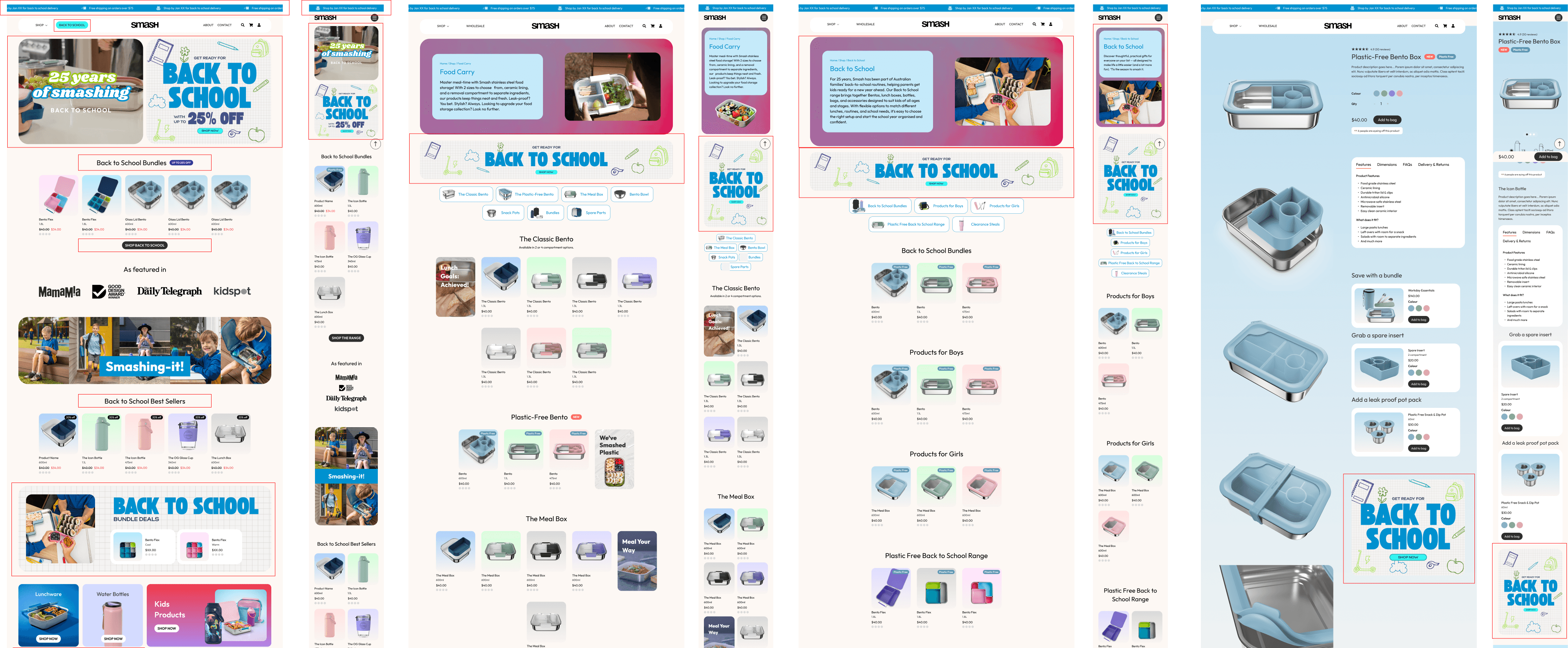
Reworking Information Architecture
The original product architecture reflected how the business organised inventory – not how customers shopped.
We restructured categories to reduce overwhelm and give hero products space to shine. Rather than long scrolling lists, products were broken into clearer groupings that made browsing feel lighter and more intentional.
To further improve discoverability, we introduced an image-led mega menu. Instead of relying on product names alone, users could visually navigate directly to products, removing guesswork and shortening the path to purchase.
We also refined backend variant logic to better reflect user expectations:
Bento inserts were consolidated into logical variants within a single product.
Conversely, products that had previously been grouped as size variants (e.g. lunch box, bento box, dip pots) were separated to reduce confusion.
These structural changes made the catalogue feel clearer and more intuitive almost immediately.
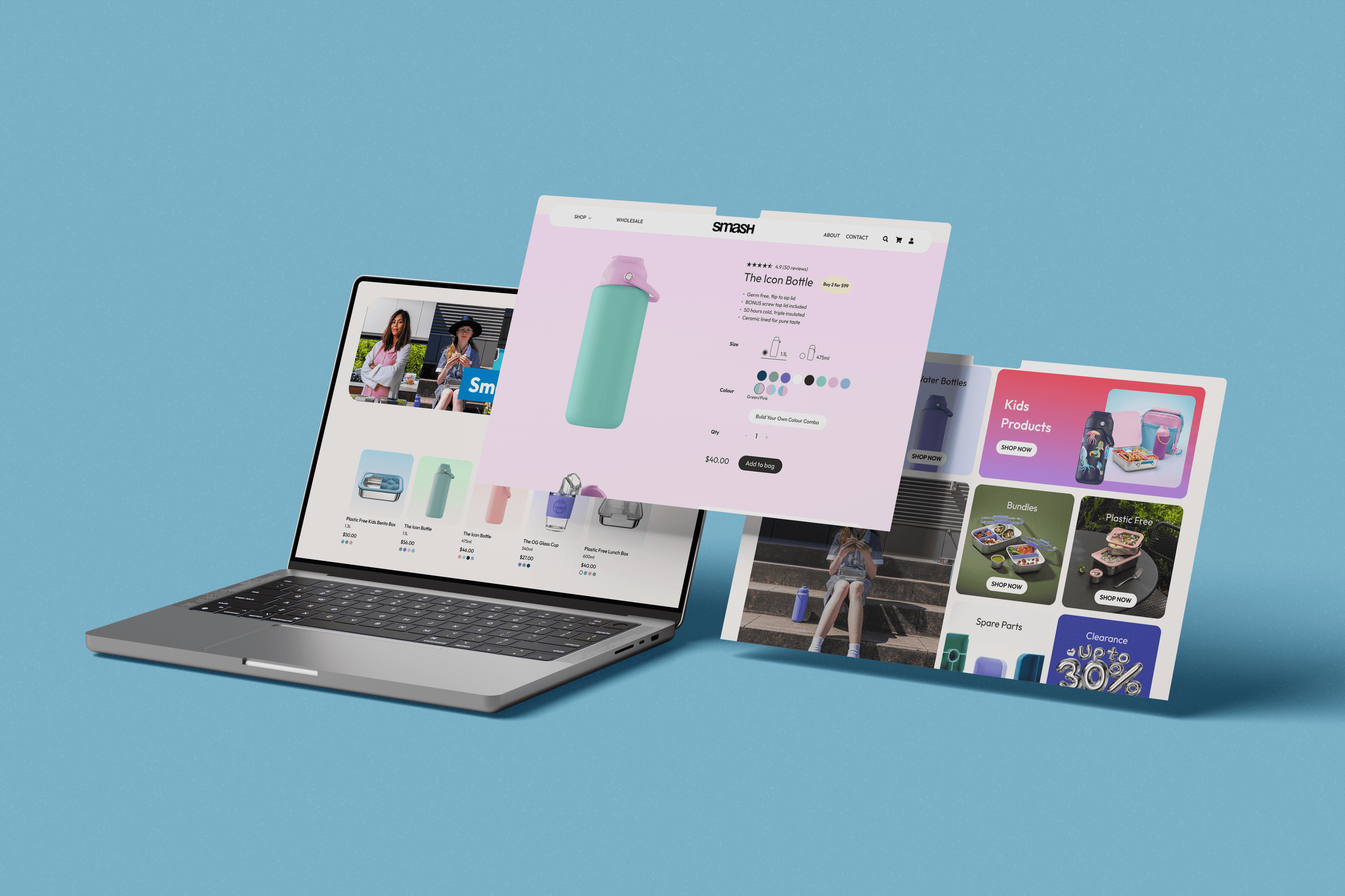
Redesigning the Product Experience
Product detail pages were completely restructured.
Previously, long descriptions dominated the layout, with little visual storytelling.
We introduced:
A clear value proposition line directly under the product title.
Structured feature sections pulled from dense descriptions.
Visual storytelling blocks using GIFs and close-up imagery.
Dedicated cross-sell modules for spare parts and complementary products.
Cart-level incentives, including “$X to free shipping.”
Intelligent product recommendations at product and cart level.
The goal was simple:
Let the products breathe.
Make their value unmistakable.

Elevating Brand Through System Thinking
While structural clarity was foundational, expression mattered.
Smash needed a digital personality that felt playful and engaging, appealing to both kids and adults.
Each product colour was assigned a distinct gradient system that carried across tiles and PDP backgrounds. This strengthened brand recognition and created a cohesive visual rhythm across the site.
We also designed a flexible campaign takeover system that allowed the brand to transform seasonally: across homepage, navigation, banners, category tiles and PDP messaging, while maintaining UX consistency.
This framework supports key moments like Back to School, Black Friday and Christmas, and extends into paid social creative for alignment across channels.
Designing for adaptability, not just launch, became a core focus of the project.
Sale Site Takeover
Navigating Constraints
Working within Shopify required thoughtful compromise.
Certain interaction ideas, including more advanced animations, were scaled back to prioritise load performance and build stability. Close collaboration with development ensured fidelity to key design moments, even within technical limitations.
We also encountered constraints related to subscription tier capabilities and product customisation complexity. In response, we refined and simplified certain concepts to ensure the most impactful features could be delivered effectively within timeline and platform limitations.
The initial launch was delivered within a tight two-month timeframe, with continued iteration and optimisation following launch.
Impact
The results were significant.
Since launch, Smash has achieved:
%+
increase in sales
%
increase in purchase conversion rate
%
increase in average spend per user
%
increase in product views
%+
growth in user engagement
%
increase in total interactions
%
increase in scroll activity
%+
growth in total users, including strong returning customer growth
Improved discoverability, clearer hierarchy and integrated cross-selling directly contributed to higher engagement and increased order value.
What began as a brand refresh became a commercially transformative digital platform.
Reflections
This project deepened my understanding of ecommerce at a systems level.
While the playful gradient system and layered interactions strengthened brand expression, they also introduced operational complexity. If approaching the project again, I would aim for slightly more restraint — maintaining personality while reducing manual overhead for the client.
The most valuable lesson was designing for change. Sale periods, seasonal campaigns and product expansions require structural flexibility across navigation, tagging, messaging and incentives. Building adaptability into the foundation proved just as important as the visual layer.
Above all, this project reinforced that clarity drives conversion.
Expression captures attention — but structure builds growth.
Evan Telfer,
E-Commerce Manager
Smash