Structuring complex product systems for better discovery and decision-making
Year
2025
Role
UX/UI Designer
Team
Myself + Client (internal team) + Developer
Timeline
4 months
Platform
Website

Overview
Hasemer is a long-standing, family-owned Australian business specialising in materials handling equipment, supplying high-quality European products across construction, mining, and entertainment industries.
With a large, technical product catalogue and diverse user base, the primary challenge was product discoverability. I was engaged to redesign the website end-to-end, with a focus on information architecture, navigation, and content structure.
This project centred on a single goal:
making complex, technical products easier to find, understand, and act on.
The Context
Hasemer is a long-standing, family-owned Australian business supplying high-quality European materials handling equipment across construction, mining, and entertainment industries.
Their reputation in the industry was strong. Their website wasn't. The existing experience had been organised around internal logic rather than user needs: a mix of product types, brands, and industries sitting side by side without clear hierarchy, no structured product detail pages, and an over-reliance on users already knowing what they were looking for. If you didn't arrive with a product name or a catalogue number, you were largely on your own.
The catalogue itself compounded the problem. A wide range of equipment types, highly technical specifications, multiple industries with distinct use cases, and a body of legacy content scattered across unstructured documents. The site expected users to navigate that complexity unaided, or to pick up the phone.
Clarifying the Opportunity
The core challenge wasn't just scale. It was the variation in user knowledge.
Hasemer's audience ranged from engineers and procurement specialists who arrived knowing exactly what they needed, to users in adjacent industries who were exploring solutions to problems they couldn't yet fully name. Some searched with precision. Others searched with uncertainty. Designing for one without accounting for the other would mean the site continued to serve only the people who already knew how to use it.
The opportunity was to build a system flexible enough to support both, without overwhelming either.

Bringing Structure to Complexity
To address the variation in user knowledge, I restructured the site around three primary entry points: by equipment type, by industry, and by what you want to lift.
The first two pathways serve users who already have a mental model of the product space. The third was the more considered addition. "What you want to lift" translates technical product categories into the language of a real-world problem. A user who doesn't know the difference between a chain block and a lever hoist does know that they need to move a steel beam. That pathway meets them where they are, and leads them toward the right product without requiring prior knowledge to get started.
Together, the three entry points create a system that doesn't force users into a single browsing mode. They can approach the catalogue the way that feels natural to them, and still arrive at the right place.
Filtering was introduced across key pages to support further refinement by product type, industry, application, and brand. This reduced dependence on search and gave exploratory users a way to narrow down without needing precise terminology.
Restructuring Navigation & Categories
The entire navigation was rebuilt to support this new structure.
This included:
• Defining clear product categories and subcategories
• Introducing dedicated sections for industries, brands, and spare parts
• Adding services such as repair and installation
• Creating a resource hub for documentation and technical materials
Filtering was also introduced across key pages, allowing users to refine results by:
• Product type
• Industry
• Application (“what you want to lift”)
• Brand
This reduced reliance on search and supported more intuitive exploration.
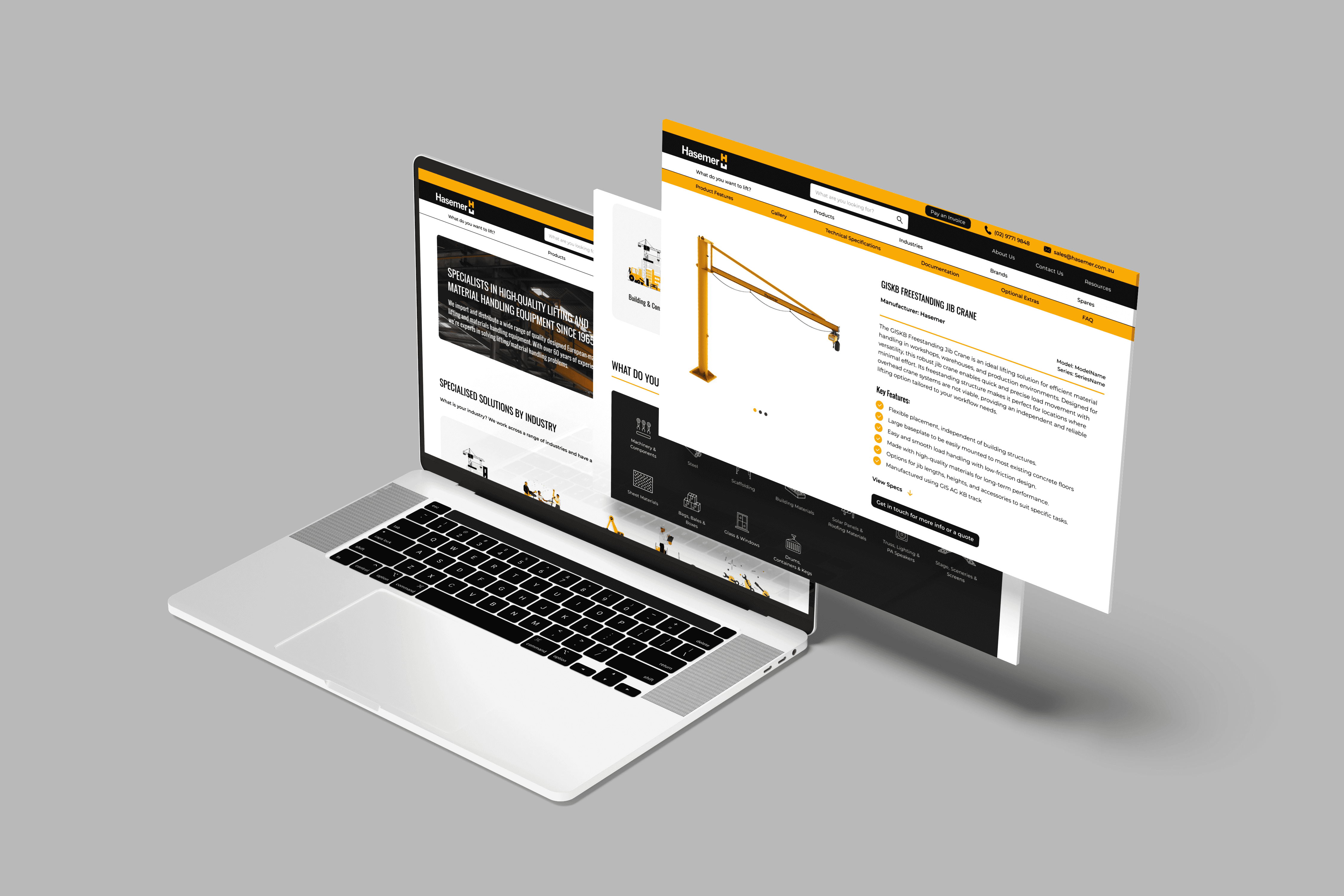
Designing a Scalable Product System
A significant portion of the project involved creating a consistent product detail page structure across the entire catalogue. Each page needed to balance technical depth with clarity, serving a specialist who wants to verify specifications and a less experienced user who needs to understand what a product actually does before they can evaluate it.
The structure I developed included a product overview, key features, technical specifications, documentation, a visual gallery, optional extras, application indicators, and supporting FAQs. Getting that content into a consistent format required close collaboration with the client: defining the structure, building templates and examples, creating spreadsheets for systematic population, guiding the team through implementation, and QAing all content before development.
It was as much content strategy as it was UX. Transforming unstructured, legacy information into a cohesive and scalable system was a substantial undertaking, and a necessary one. Without it, even a well-designed navigation would have dead-ended users on pages that couldn't support their decision.
Enhancing Understanding Through Interaction
To support comprehension of highly technical products, I introduced interactive product features on select pages.
Using 3D models, users could:
• Explore product components visually
• Hover over labelled features
• Zoom into specific areas for more detail
This helped translate complex engineering concepts into something more accessible — reducing reliance on dense technical language and supporting faster understanding.
It also reinforced Hasemer’s premium positioning, showcasing the quality and detail of their products in a more engaging way.

Key Design Decisions
The central design challenge was serving two users simultaneously without compromising either.
For the specialist, reducing reliance on search meant building clear navigation and filtering systems robust enough that someone with precise requirements could move through the catalogue quickly, without having to wade through products that weren't relevant to them. For the less experienced user, the "what you want to lift" pathway and the visual product cues provided progressive disclosure: starting from a problem, building understanding gradually, arriving at a product with enough context to feel confident.
The 3D interactive product features on select pages served a similar purpose. Dense technical language can obscure rather than clarify for users without specialist knowledge. Allowing someone to visually explore product components, hover over labelled features, and zoom into specific areas translates engineering detail into something comprehensible. It also reinforced the quality of what Hasemer supplies, which mattered for a brand whose reputation was stronger in person than online.
Balancing Depth with Usability
Given the volume of technical content, the challenge was not just inclusion, but organisation.
Content was structured to:
• Surface key information quickly
• Allow deeper exploration where needed
• Avoid overwhelming users upfront

Constraints
This project was shaped by several challenges:
• A highly complex and unstructured content base
• No centralised product data, information sourced from legacy documents
• Limited ability to user test
• Balancing client preferences with user-centred decisions
A significant portion of the work involved not just design, but content structuring and system creation.
Outcome
The final design delivered:
• A fully restructured information architecture
• Clear navigation and multiple discovery pathways
• A scalable product page system
• Improved access to technical documentation
• A more intuitive and user-friendly browsing experience
The client responded positively to the design direction and system.
Post-Launch Evolution
The IA was a recurring point of negotiation throughout the project. Hasemer's team had deep knowledge of their own catalogue, and that expertise shaped strong intuitions about how it should be organised. Those intuitions were built from the inside of the product outward. My argument, which I made explicitly and which was ultimately accepted, was that organising navigation around internal product logic would create barriers for the significant portion of their audience who lacked specialist knowledge. Users who don't already know the terminology can't use terminology-led navigation. The structure that went to build reflected that user-centred framing.
Post-launch, the client made modifications to the navigation and removed certain filters. Some of those changes reintroduced complexity the original structure had been designed to reduce.
It's a pattern that surfaces regularly in complex content systems. The logic of a well-structured IA can feel counterintuitive to people who know the catalogue deeply, precisely because they don't experience the same discovery friction a new user does. What I'd do differently is document not just the structure but the reasoning behind it, explicitly and accessibly, so that future decisions can be evaluated against the original user-centred rationale rather than made in isolation from it.
Reflection
This project reinforced the importance of designing for multiple mental models, particularly in industries where user knowledge varies significantly.
Working in an unfamiliar domain required a deliberate shift in approach: focusing on user intent rather than industry terminology, and treating the gap between what a specialist knows and what a newcomer needs as a design problem rather than a given. The "what you want to lift" pathway came directly from sitting with that gap long enough to find an answer that didn't require the user to already know the answer.
It also clarified something about the scale of content-driven design work.
Structuring information at this level requires time, collaboration, and ongoing ownership. The design can create the right conditions for clarity, but without continued governance, the structure that supports it is vulnerable.
If I were to take this further, I'd prioritise direct user testing across the knowledge spectrum, continued refinement of the filtering and comparison tools, and stronger documentation of IA rationale to support long-term integrity. Structure is not just organisation. It's what makes a complex system feel navigable to someone who's never encountered it before.
Product documentation translating from large csv files to navigable documentation on site.


About
Case Studies
Capabilities